Born as an innovative startup active in Rome and Milan, Chief Beauty Officer (CBO) embraces the corporate wellness culture with the aim of offering wellness and beauty services directly at the workplace.
CLIENT: CHIEF BEAUTY OFFICER
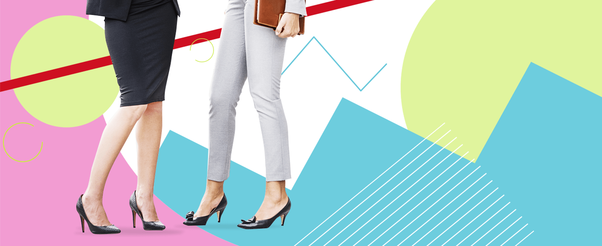
Communicate with elegance the concept of corporate wellness
// Enhance the brand identity and its perception by the public
OVERVIEW
CHALLENGE
Chief Beauty Officer has chosen us to strengthen the identity and improve the public’s perception of the brand. The challenge was to redesign the brand experience by focusing on an innovative and functional coordinated image, able to transmit strong values such as professionalism and quality to allow a business-to-business audience to know the brand, easily distinguish it and immediately establish a contact.
PROJECT
The objectives of the project were well defined: restyling of the logo and redesign of the official website, giving a new look and feel and redesigning the structure to enhance the overall brand identity starting from the online experience.
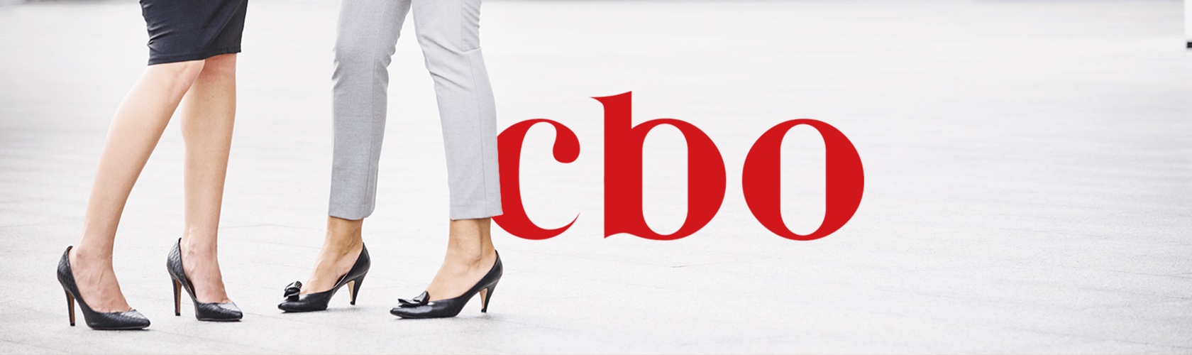
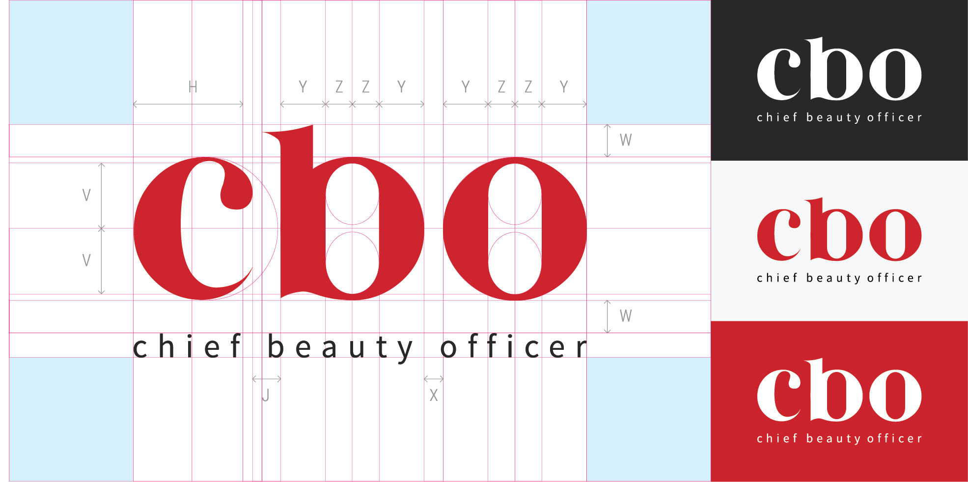
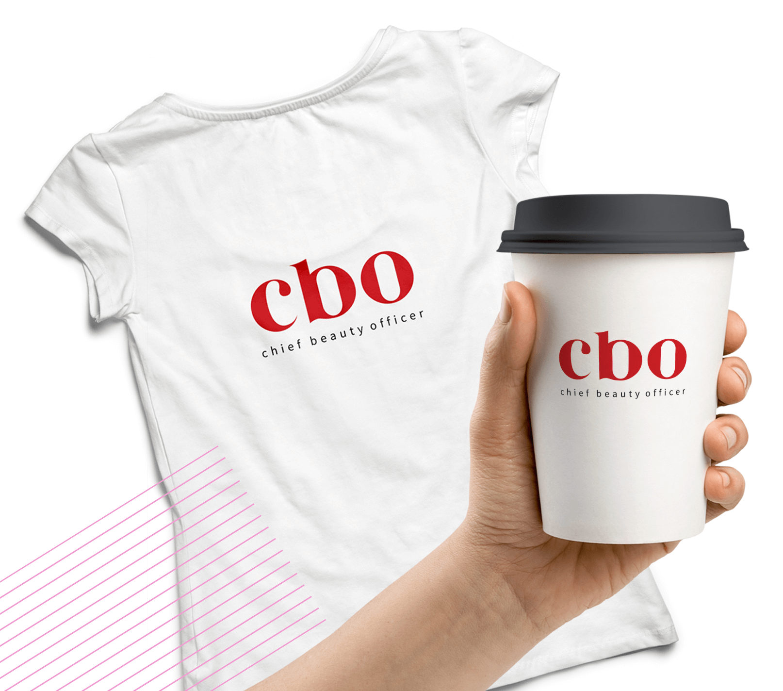
LOGO
During the design phase of the logo, we exploited the elements of the brand to create awareness and establish strong and positive associations in the minds of people. The visual elements were chosen on the basis of certain criteria such as memorability and significance to contribute to the formation of associations related to corporate wellness and to the gesture of the Chief Beauty Officer services. It is in the brushstroke that we have identified the highest expression of one of the company’s services, the manicure, inserting it in the acronym CBO with a bright red.
The characteristic elements of the logo, in line with the client’s objectives and the brand’s mission, were born from a thorough study of keywords and international best practices, thus creating a logo with soft and elegant features, a symbol of professionalism and reliability.
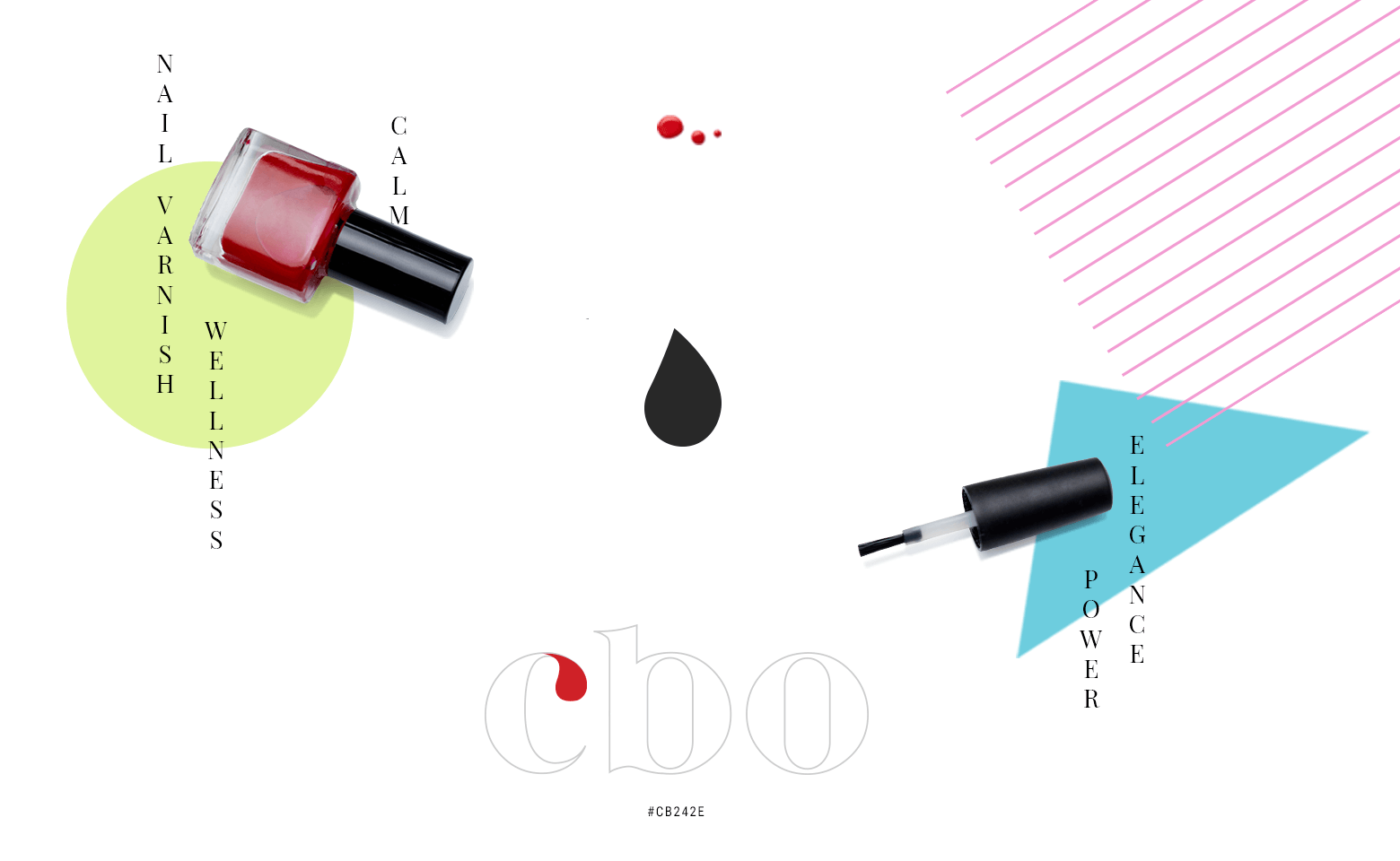
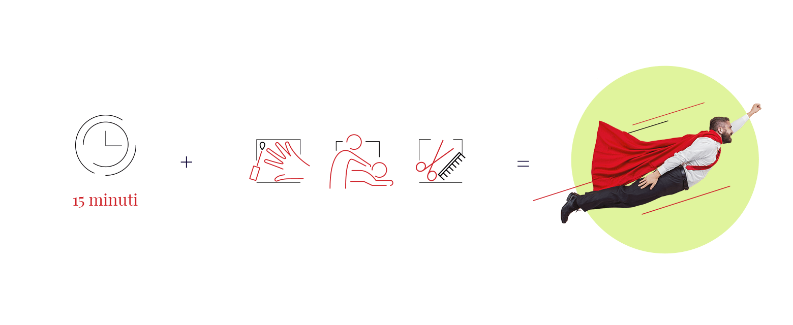
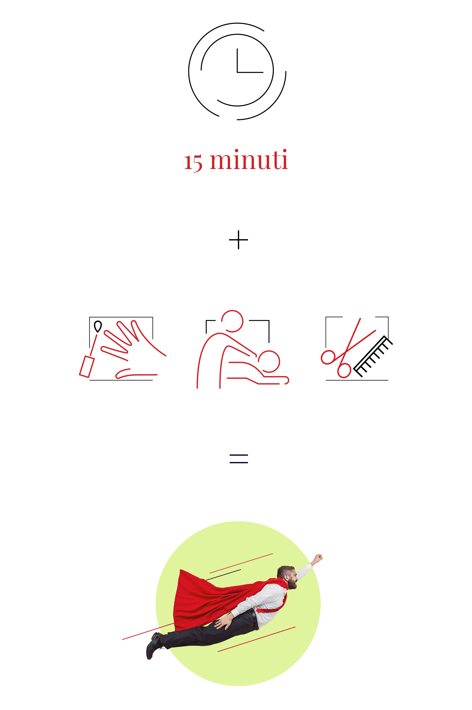
“The concept is based on 15 minutes of wellness, just the time for a coffee break”
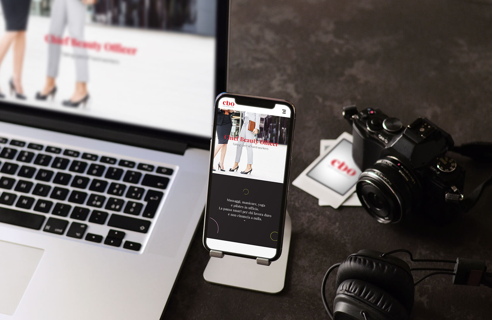
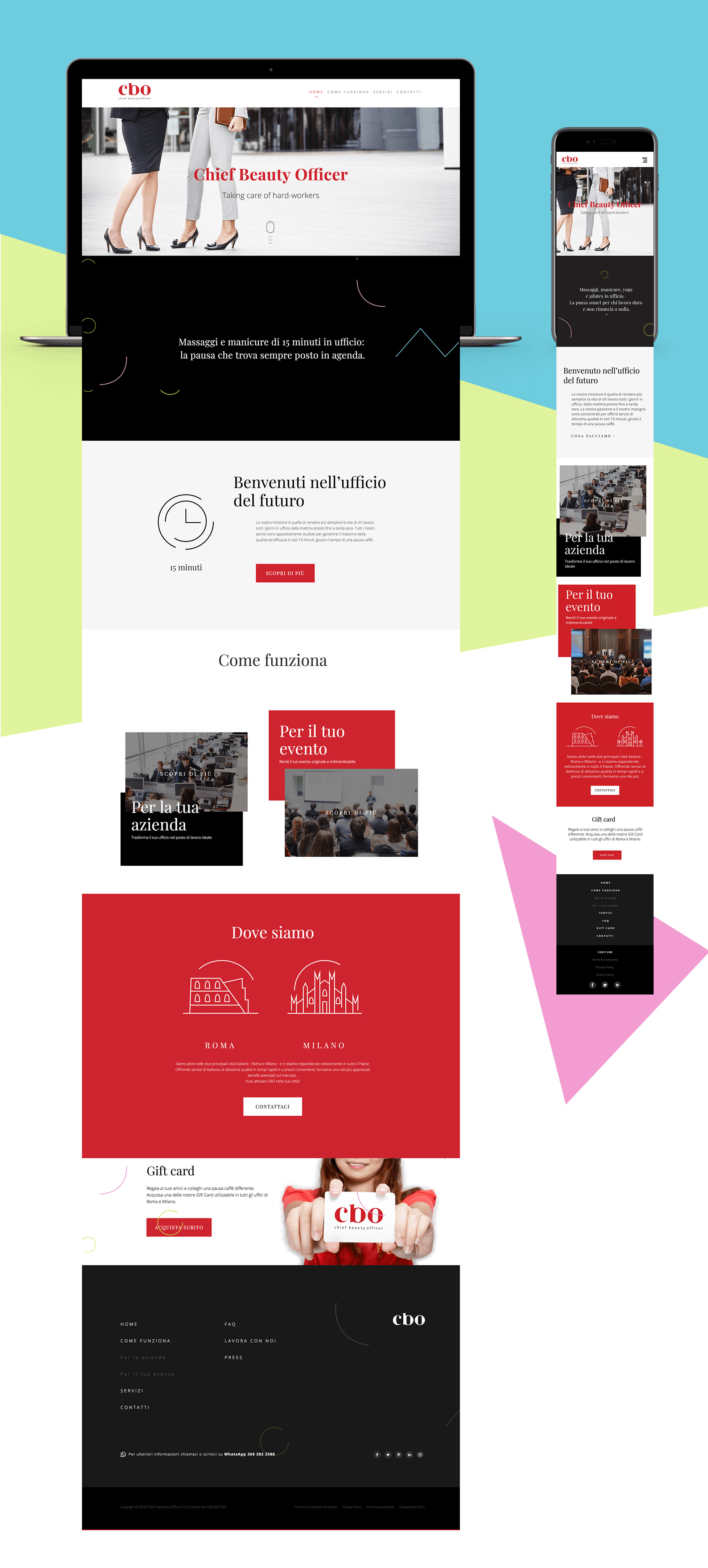
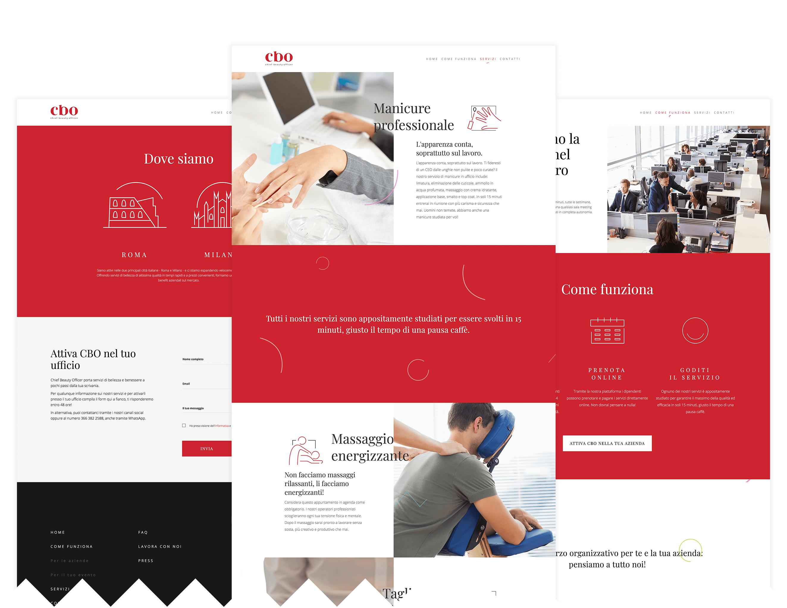
WEB
The responsive web platform has been designed to allow a better use of content by users.
In the design phase we have identified some graphic elements that refer to the gesture of the services offered by CBO so as to develop and reuse them in the various sections of the site. Forms and lines refer to the three services of the company: manicure, massage and hair cut and set.
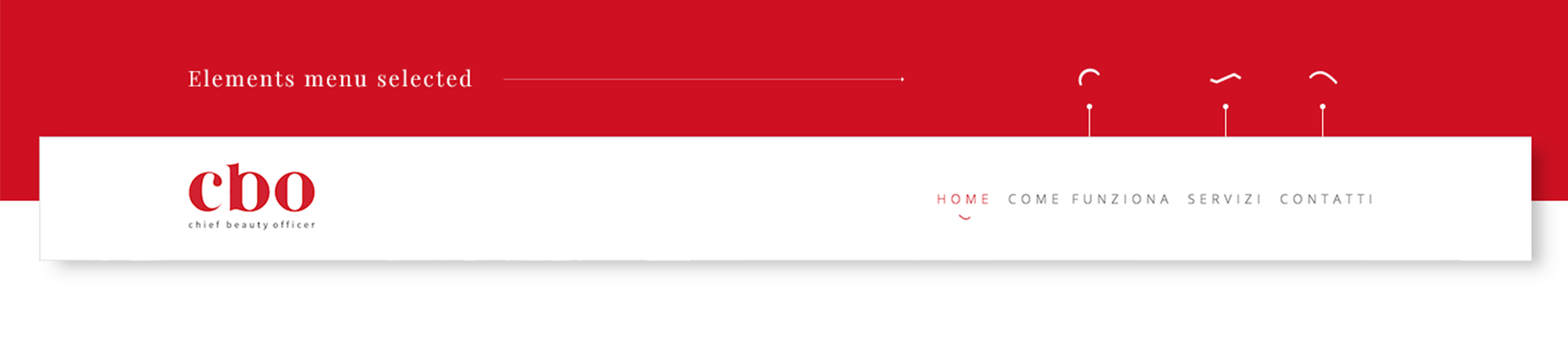
The new content architecture has been structured to make navigation faster, to guarantee greater ease in the contact acquisition process and to offer an intuitive, fluid and dynamic user experience, thanks to the introduction of micro-interactions.
EVOLUTION
It often happens that a brand is involved in a process of change and feels the need to evolve, telling itself differently to its target audience.
Through the new logo and website of CBO, we have given the brand the possibility to convey a new message, in line with the company’s vision and mission, based on values such as professionalism, well-being and attention to detail and investing in emotions, stories and relationships to generate a lasting bond over time with current and potential customers.